
Did you know that more than half of website visits now come from mobile devices? That means if your website isn’t optimized for mobile. You’re potentially missing out on more than half of your potential customers. In today’s digital age, more and more people are using their mobile devices to access the internet.
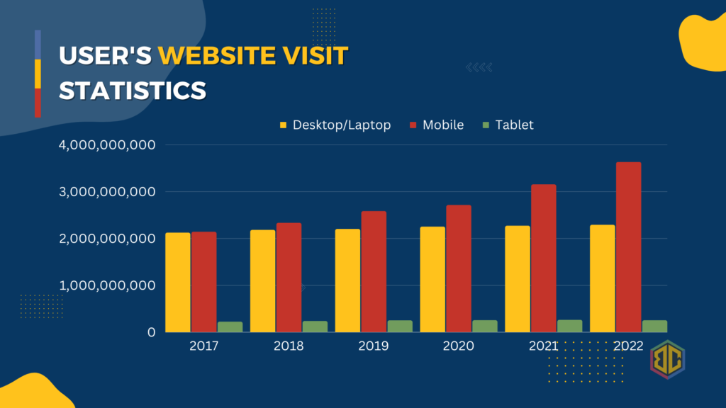
In fact, according to a recent survey, in 2022, mobile devices are responsible for the largest percentage of visited websites, accounting for approximately 69.2% of all website traffic worldwide. This is followed by desktops, which account for around 37% of website traffic, while tablets and other devices make up the remaining 3.8 % of website traffic.
The data clearly shows that mobile devices are becoming increasingly important for website visits, while desktop devices are slowly losing their share. Tablet devices, on the other hand, have been on a decline in terms of website visits over the years. As such, it’s crucial for website owners to ensure that their website is mobile-friendly and optimized for a better user experience on mobile devices.
This trend shows that more and more people are using their mobile devices to access the internet and visit websites. This is likely due to the convenience and accessibility that mobile devices provide, allowing users to browse the internet on the go or from the comfort of their own homes.
In addition, Google and other search engines prioritize mobile-friendly websites in their search results, which means that having a mobile-friendly website can also improve your search engine rankings and drive more traffic to your site.
This means that having a mobile-friendly website is more important than ever before. In this article, we will explore the reasons why your website needs to be mobile-friendly and the benefits it can provide for your business.
- Better User Experience – The primary reason your website needs to be mobile-friendly is to provide a better user experience. A mobile-friendly website is designed to work seamlessly on all devices, including smartphones and tablets. This means that your website visitors can easily navigate your site and access the information they need, no matter what device they are using. A website that is not optimized for mobile devices can be difficult to navigate and read, leading to a frustrating user experience.
- Increased Traffic Having a mobile-friendly website can also help increase your website traffic. When your website is mobile-friendly, it will rank higher in mobile search results. This is because search engines like Google prioritize mobile-friendly websites in their search results. This means that more people are likely to find your website when they search for your products or services on their mobile devices.
- Higher Engagement A mobile-friendly website can also increase user engagement. When users can easily navigate your website on their mobile devices, they are more likely to spend more time on your site, explore your content, and engage with your business. This can lead to higher conversion rates and ultimately, more revenue for your business.
- Improved Brand Image Having a mobile-friendly website can also improve your brand image. When your website is optimized for mobile devices, it shows that you care about your customers’ experience and are willing to invest in technology to improve it. This can help build trust and credibility with your customers and make them more likely to do business with you.
- Better Website Analytics A mobile-friendly website can also provide better website analytics. With a mobile-friendly website, you can track your website visitors’ behavior and preferences on both mobile and desktop devices. This can help you make data-driven decisions about how to optimize your website to provide the best user experience and achieve your business goals
In conclusion, having a mobile-friendly website is essential in today’s digital age. It can provide a better user experience, increase website traffic, improve user engagement, enhance your brand image, and provide better website analytics. By investing in a mobile-friendly website, you can ensure that your business is well-positioned for success in the mobile-first world.
If you need help making your website mobile-friendly, consider working with a professional web design company that specializes in mobile optimization. They can help you design and develop a website that is optimized for all devices, ensuring that your business can reach its full potential.
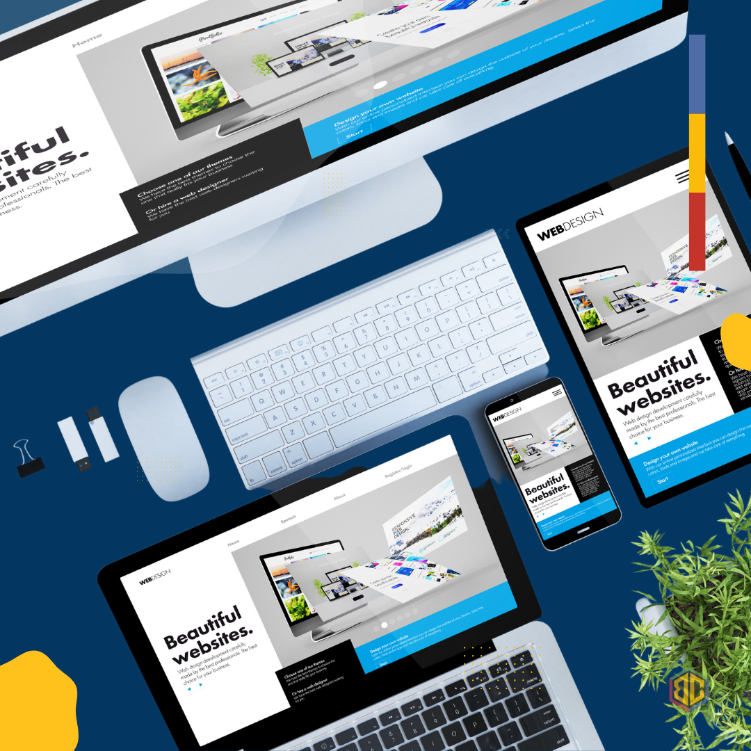
Our company specializes in creating beautiful, responsive websites that look great on any device, from desktops to smartphones. With our expertise in mobile optimization, we can ensure that your website is not only visually appealing, but also easy to navigate and use on any mobile device.
By partnering with us to create a mobile-friendly website, you can increase your website traffic, engage with more customers, and ultimately boost your sales and revenue. Don’t let a non-responsive website hold you back – let us help you take your business to the next level with a mobile-friendly website. Contact us or simply visit our Facebook page to know more.
No Comments